Logo for a real estate development & services company.
Logo for record company, inspired by the harbour area in Gothenburg, Sweden.
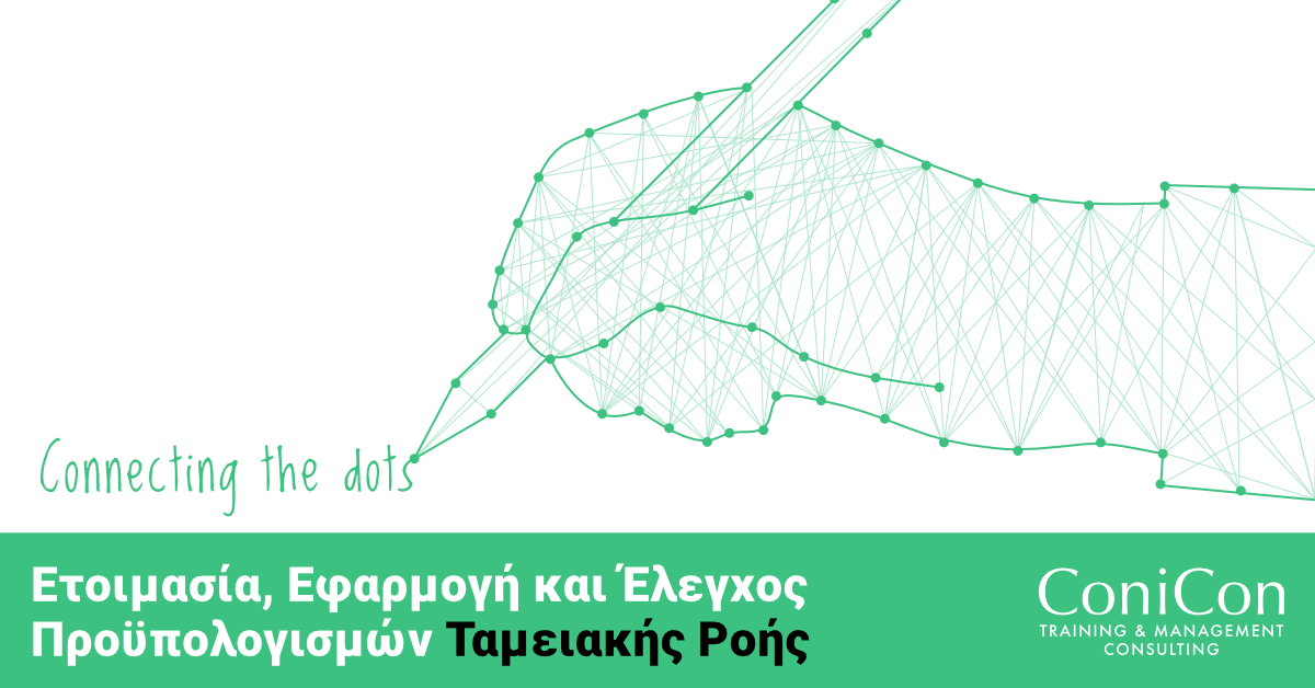
“Connecting the dots” concept created in collaboration with staff for ConiCon Ltd, a management consultant and training company. The wanted to market their seminars in Cyprus on social media and needed a new graphic concept.
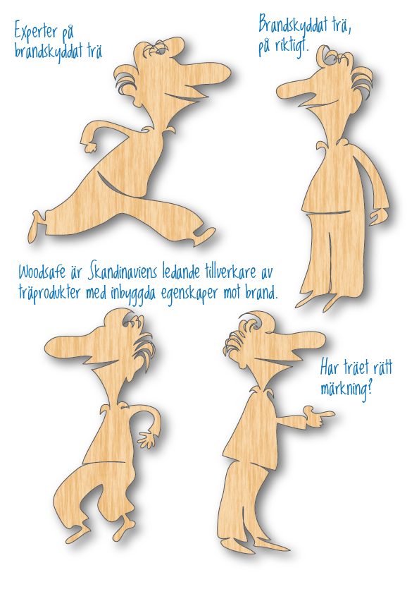
Woodsafe is company manufacturing fire proof wood. They wanted to create an information campaign describing the benefits of their product, comparing to other wood qualities etc. The wooden figures are highly visible compared to traditional ads in this segment. And they are clear about the content and the message.
To catch the readers attention is the ad illustrators job. In this case, to attract professional chefs to further education in Switzerland. I´m also inspired by the superhero trend, not less than four different films with superheroes premiered in the spring. And I´m also giving attention to the profession’s labor-intensive character – chefs are super →
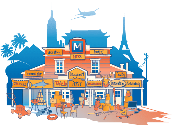
Illustration for Swedish company MSAB, to be used in digital marketing, social media etc. We aimed to create something that resemble an old fashion general store, with additional details as travel destinations, and a lot of different equipment on the porch.
Icons for different business areas, trading, construction, services, shipping, tourism, finance, governmental, manufacturing – and the last icon is a symbol for reading, or articles. Conicon is a client is a company dealing with management consulting and training.
How is the ad applied on the ice? We have all seen this kind of advertisment during hockey games, but how is it put in place? I created this manual in collaboration with client to simplified the procedure. This version is without text.
Black and white icons/symbols for web. Simplicity and clean graphic design with usability in mind.